Selecting an Appropriate Font for Writing a Literature Review
 When writing a Literature Review, the appearance of your text is as important as the content with your dissertation. There are many accepted fonts for national and international dissertations, all of which provide a clear, coherent and concise appearance for a reader of your literature review.
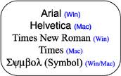
 For dissertations written in a modern and present style, the recommended font is Arial. This font provides a smooth transition between letters, allowing the reader more time to concentrate on the quality of the dissertation and less time trying to adjust to the layout of the piece. Where a budget is available, it is recommended to purchase the font, Calibri. This font works in much the same way as Arial, a slight difference being the width of lettering and may be better suited for work requiring a crisper appearance to the text, for example when using printed materials for those suffering with poor eye-sight.
Past or Classical Style Literature Reviews
For dissertations written in a past or classical style, Times New Roman is the most recommended font to use. It provides an elegantly vintage appearance, suitable for reviewing novels or providing a well organised dissertation for assessment. The choice of font can drastically affect the exterior quality of a dissertation and when preparing your Literature Review, time should be spent considering the effect of thought that you wish to convey. For modern titles, a modern font should be used whereas for classical titles, a more classical font should be used. If you find yourself wanting to express further emotion in your dissertation than these standard fonts provide, you may use a more personal font that you feel assists in the presentation of your Literature review but make sure that your font remains entirely legible, fluent and without non-standard symbols.
All commas, full stops and punctuation marks should appear the same in any professional font as to avoid confusion and if a font appears to possess a punctuation mark that is not entirely standard, it is best to avoid that font entirely or to replace the non-standard mark with a similar or matching font.